In our previous posts, we covered Pandas basics and data cleaning. Now that we have a clean dataset of 2022 rideshare trips, it’s time to extract actual insights.
Statistical analysis isn’t just about finding the “average.” It’s about understanding variability, spotting outliers, and finding relationships between different parts of your data.
1. Beyond the Mean: Full Statistical Summaries
We previously used .mean() and .sum(), but often we need a broader view. The .describe() method is a powerhouse when combined with groupby().
# Detailed statistics for tips by day of the week
stats = df.groupby('weekday')['tip'].describe()
print(stats)
This gives us the count, mean, standard deviation, min, max, and quartiles for every day. You’ll often notice that while the mean is useful, the standard deviation tells you how much tips fluctuate.
2. Visualizing Distributions with Boxplots
A table of numbers is hard to read. A Boxplot is the gold standard for visualizing distributions and identifying outliers.
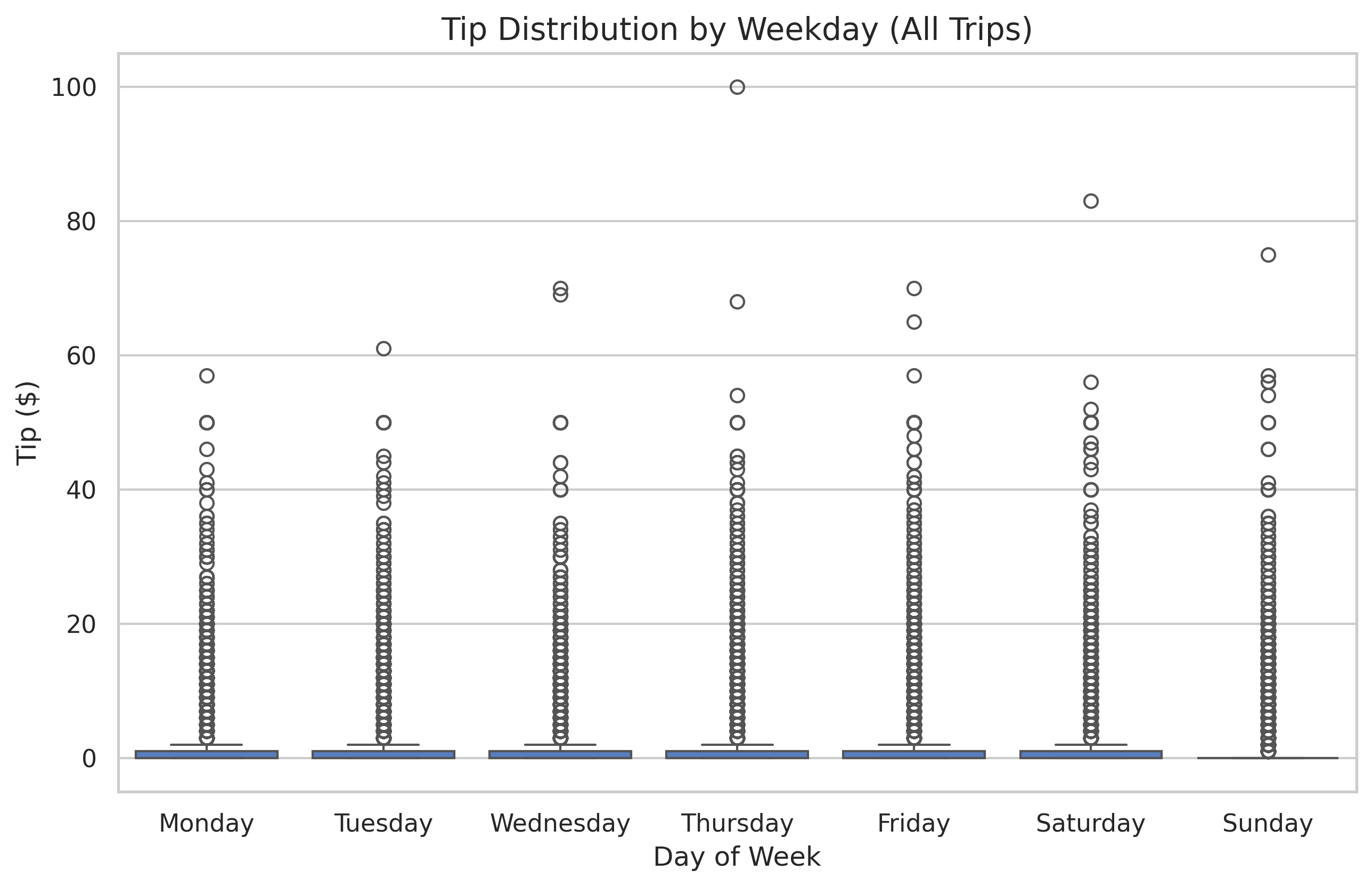
Understanding the Box
- The Box: Represents the Interquartile Range (IQR), or the middle 50% of your data.
- The Line in the Box: The Median (50th percentile).
- The “Whiskers”: Extend to show the range of the data, excluding outliers.
- The Dots: Individual data points that fall far outside the expected range (outliers).
3. Filtering Subsets for Better Insights
In our dataset, most rides ($>80\%$) have a tip of $0. If we include all these zeros in our boxplots, the useful information about actual tips gets compressed at the bottom.
To see the distribution of tips when people actually decide to tip, we filter the data:
df_tippers = df[df['tip'] > 0]
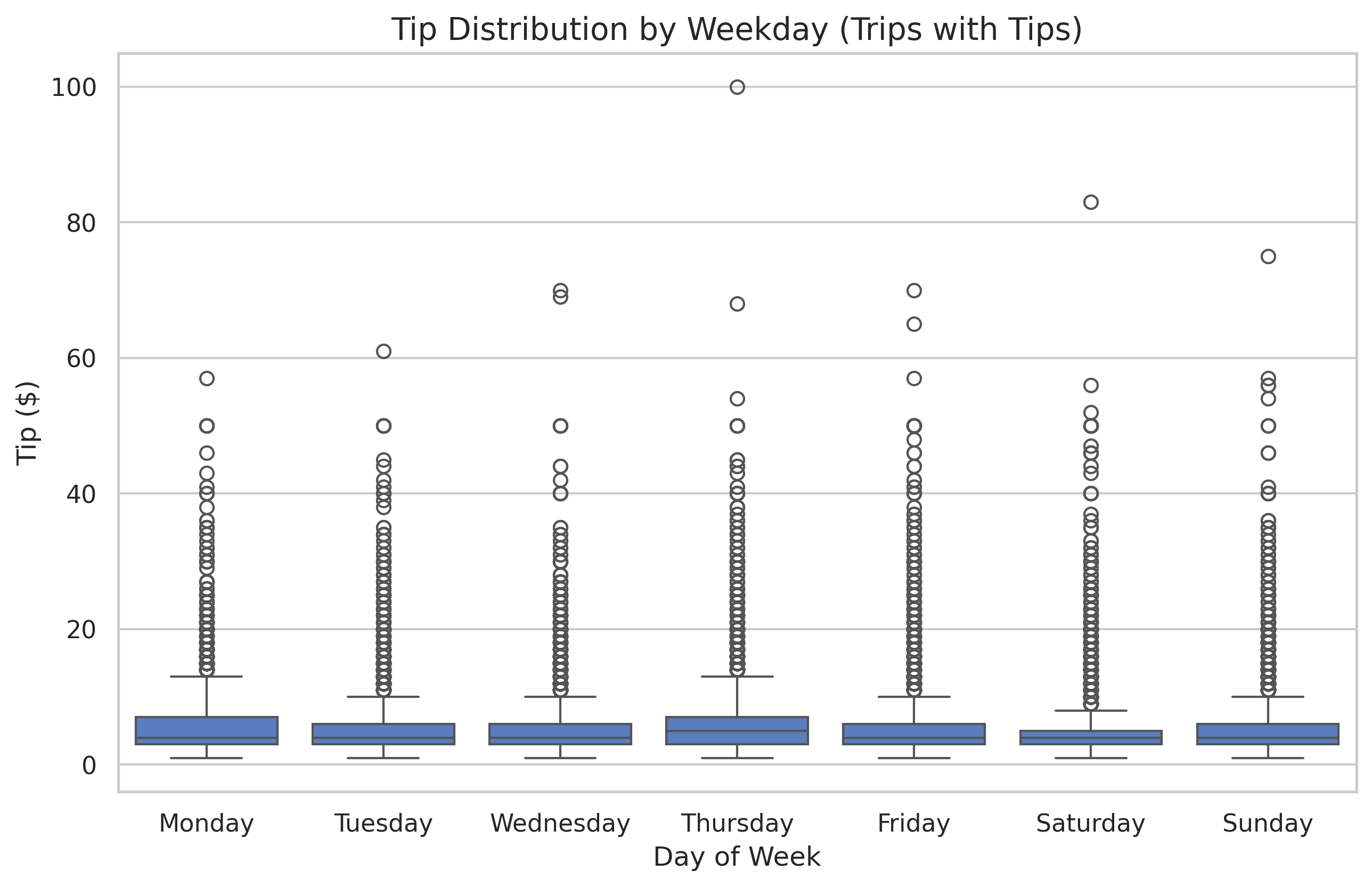
Now we can clearly see that while tipping frequencies are similar across days, Saturdays and Sundays often see slightly higher “extreme” tips.
4. Time-Based Trends: Tipping by Hour
Does the time of day affect your chances of getting a tip? We can calculate the percentage of trips that received a tip for every hour of the day.
# Calculate tip percentage per hour
hour_stats = df.groupby('hour')['tip'].apply(lambda x: (x > 0).mean() * 100)
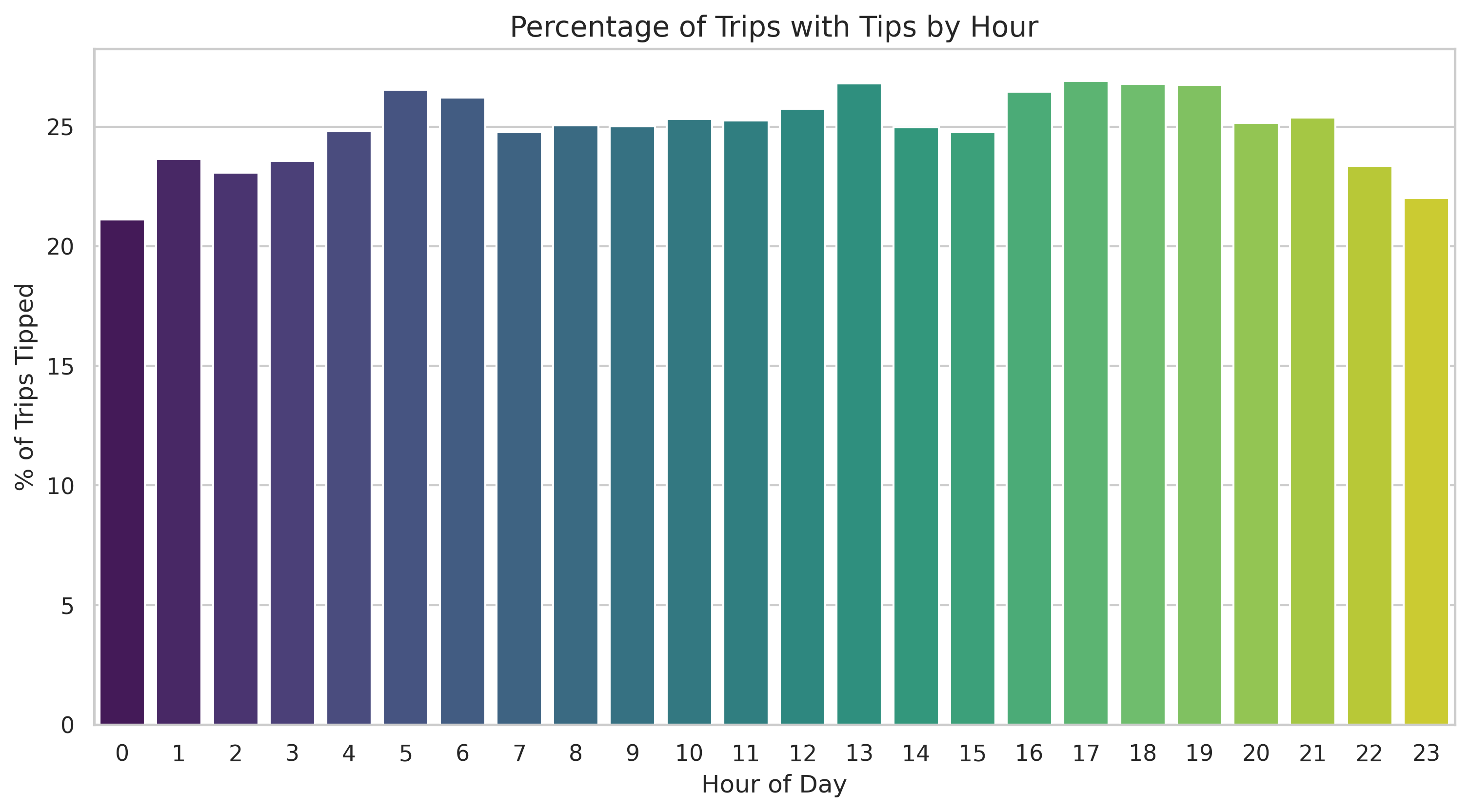
Interestingly, we see peaks during late-night hours and morning commutes, which might suggest different tipping behaviors for “party” rides versus “professional” rides.
5. Correlation: Connecting the Dots
One of the most important questions in data science is: “Does variable A affect variable B?”
For example, do longer rides lead to higher tips? We can visualize this with a scatter plot and quantify it with the Pearson Correlation Coefficient.
# Calculate the correlation coefficient
correlation = df['trip_miles'].corr(df['tip'])
print(f"Correlation between miles and tip: {correlation:.3f}")
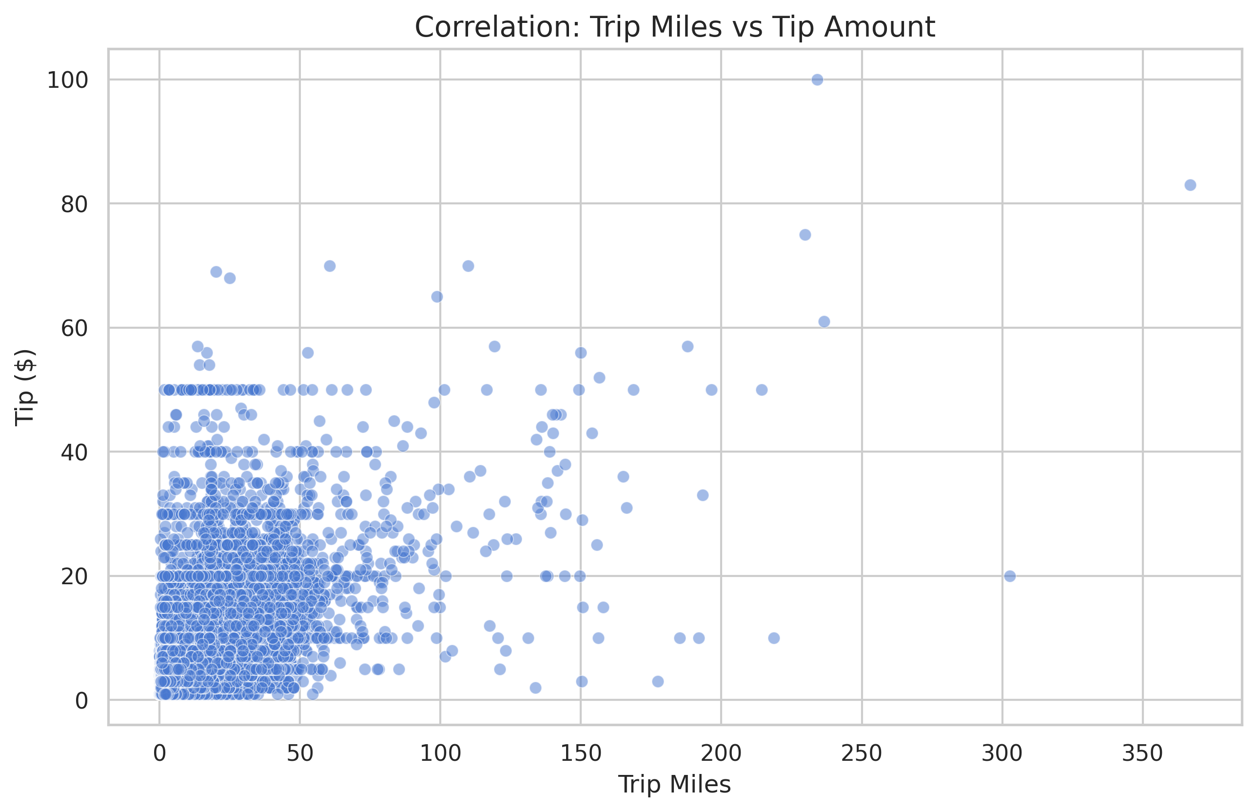
A correlation of 1.0 is a perfect linear relationship. A 0.0 means no relationship. In our data, we see a moderate positive correlation (around 0.637), meaning that while longer rides generally mean higher tips, it’s certainly not a guarantee!
Conclusion
We’ve moved from simple counting to complex statistical relationships. By combining grouping, filtering, and visualization, we can start to tell stories about why our data looks the way it does.
In the next post, we’ll dive into Geospatial Analysis to see where these trips are actually happening!