Welcome to the second post in our Pandas series! In Pandas 101, we covered the basics of loading and inspecting data. Today, we’ll get our hands dirty with a real-world problem: analyzing ridesharing data from the city of Chicago in 2022.
In this tutorial, we will explore:
- Data cleaning and column selection.
- Visualizing distributions using histograms.
- Calculating proportions and proportions from subsets.
- Understanding conditional probability through data filtering.
1. Import the Python Libraries
As always, we start by importing our primary tools: pandas for data manipulation and matplotlib for plotting.
import pandas as pd
import matplotlib.pyplot as plt
2. Load the Dataset
We’ll use a downsampled version of the Chicago Rideshare dataset (2022). Downsampling helps us work efficiently with large datasets without sacrificing the statistical properties of the data.
# Load the dataset
df = pd.read_csv("rideshare_2022.csv", parse_dates=['Trip Start Timestamp', 'Trip End Timestamp'])

# Show the first five rows
df.head()
Inspecting Columns
The dataset contains information about trip IDs, timestamps, duration, distance, and costs. Let’s look at the full list of columns and their types:
df.info()
3. Select Columns of Interest
EDA often involves narrowing our focus. We’ll select only the columns relevant to our analysis—like trip duration, distance, and tips—and rename them for easier access (removing spaces and using lowercase).
columns_of_interest = [
    'Trip Start Timestamp', 'Trip Seconds', 'Trip Miles', 'Fare', 'Tip',
    'Additional Charges', 'Trip Total', 'Shared Trip Authorized',
    'Trips Pooled', 'Pickup Centroid Latitude', 'Pickup Centroid Longitude',
    'Dropoff Centroid Latitude', 'Dropoff Centroid Longitude'
]

df = df[columns_of_interest]

# Rename columns to snake_case
df = df.rename(columns={i: "_".join(i.split(" ")).lower() for i in df.columns})

# New column summary
df.info()
4. Visualize the Data
Visualization is key to understanding how our data is distributed.
4.1 Rides Throughout the Year
Let’s create a date column and plot a histogram to see how rides are distributed over time. We’ll use density=True to scale the plot so the total area equals 1, making it look like a probability density function.
df['date'] = pd.to_datetime(df['trip_start_timestamp'].dt.date)

# Plot the histogram of rides per day
df.hist('date', density=True)
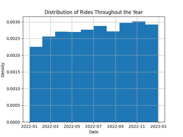
The rides appear to be fairly uniform throughout the year, with minor fluctuations typical of real-world data.
4.2 The “Tip” Distribution
Let’s observe the distribution of the tip column. This variable tells us about the extra earnings for drivers.
# Plot tip distribution
df.hist('tip', density=True, bins=100);
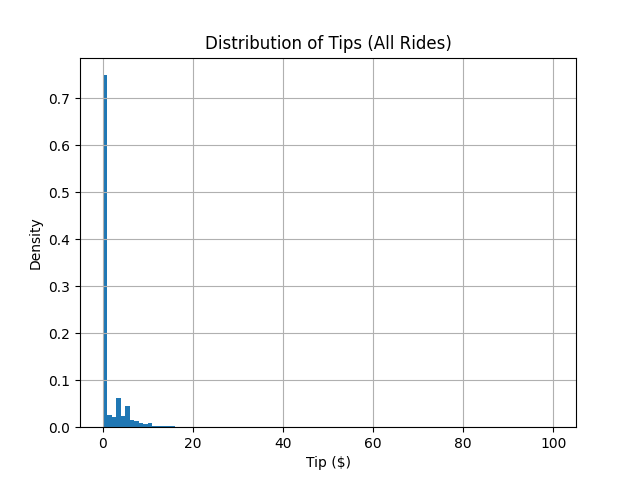
Notice the massive spike at zero? This tells us that the majority of riders do not leave a tip.
5. Conditional Distributions
What happens if we only look at the people who did tip? This is a conditional distribution: $P(\text{tip amount} \mid \text{tip} > 0)$.
# Percentage of riders who tip
tippers = df['tip'] > 0
fraction_of_tippers = tippers.sum() / len(df)
print(f'The percentage of riders who tip is {fraction_of_tippers*100:.0f}%.')

# Filter for tippers and re-plot
df_tippers = df[tippers]
df_tippers.hist('tip', density=True, bins=100);
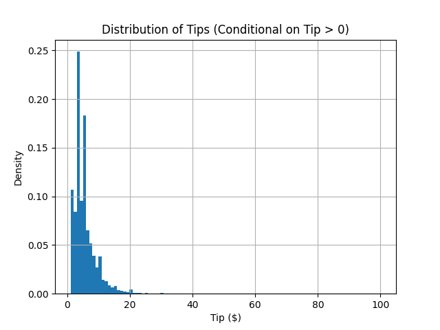
Now we see a much more interesting shape! By discarding the zero values, we can better understand the behavior of those who choose to tip.
6. Splitting Data into Subsets (Weekday Analysis)
We can also condition our data on other factors, like the day of the week. Do people tip more on weekends?
# Extract the day of the week
df['weekday'] = df["date"].dt.day_name()

# Count rides per day
WEEKDAYS = ['Monday', 'Tuesday', 'Wednesday', 'Thursday', 'Friday', 'Saturday', 'Sunday']
daily_ride_counts = df['weekday'].value_counts().reindex(WEEKDAYS)

# Count tippers per day
df_tippers = df[df['tip'] > 0]
daily_tippers_counts = df_tippers['weekday'].value_counts().reindex(WEEKDAYS)

# Calculate conditional probability: P(tip | weekday)
df_daily_aggregation = pd.concat(
    [daily_ride_counts, daily_tippers_counts],
    axis=1,
    keys=['ride_count', 'tippers_count']
)
df_daily_aggregation["tips_percentage"] = (
    df_daily_aggregation['tippers_count'] / df_daily_aggregation['ride_count'] * 100
)

df_daily_aggregation
The resulting table might look like this:
| weekday | ride_count | tippers_count | tips_percentage |
|---|---|---|---|
| Monday | 79013 | 19779 | 25.03% |
| Tuesday | 82576 | 20898 | 25.31% |
| Wednesday | 88034 | 22691 | 25.78% |
| Thursday | 95721 | 24210 | 25.29% |
| Friday | 115923 | 29256 | 25.24% |
| Saturday | 132872 | 33215 | 25.00% |
| Sunday | 96959 | 23294 | 24.02% |
Interestingly, while there are significantly more rides on Fridays and Saturdays, the probability of a rider tipping remains remarkably consistent across most days.
7. Conclusion
In this lab, we’ve moved beyond basic table manipulations to exploring distributions and conditional probabilities. You’ve learned how to:
- Clean and rename columns for better readability.
- Use histograms to interpret data distributions.
- Apply boolean indexing to create conditional subsets.
- Aggregate data to find behavioral patterns (like weekday tipping consistency).
Happy coding, and see you in the next lab!